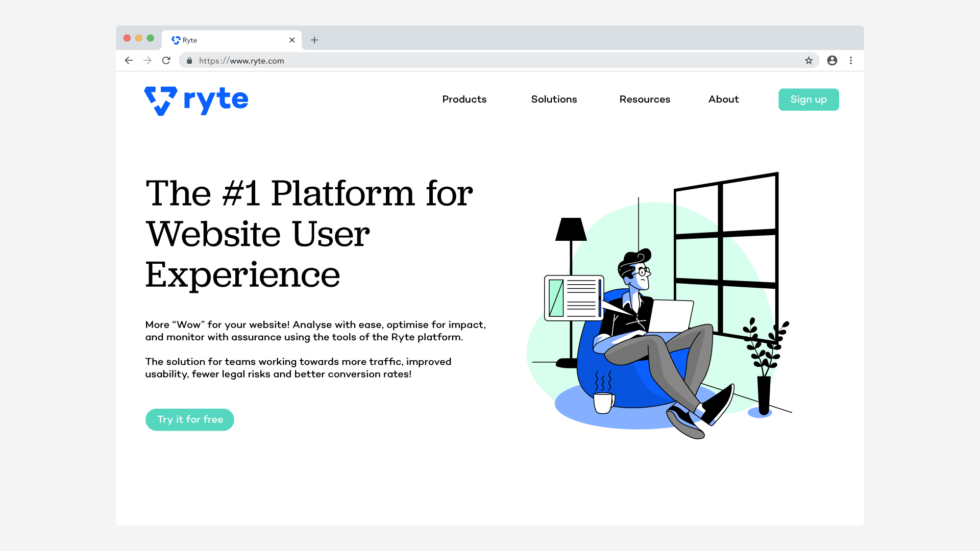
Since 2012, Ryte have been a foundation for digital success. Ryte creates softwares that help digital marketers, agencies, and freelancers to make their websites the best they can be.
Ryte has been growing quickly and they are on a mission to become the leading platform in the field of Website User Experience globally. However, their brand had remained somewhat stuck in their early founding years. So they needed to rebrand therefore they held an open competition.
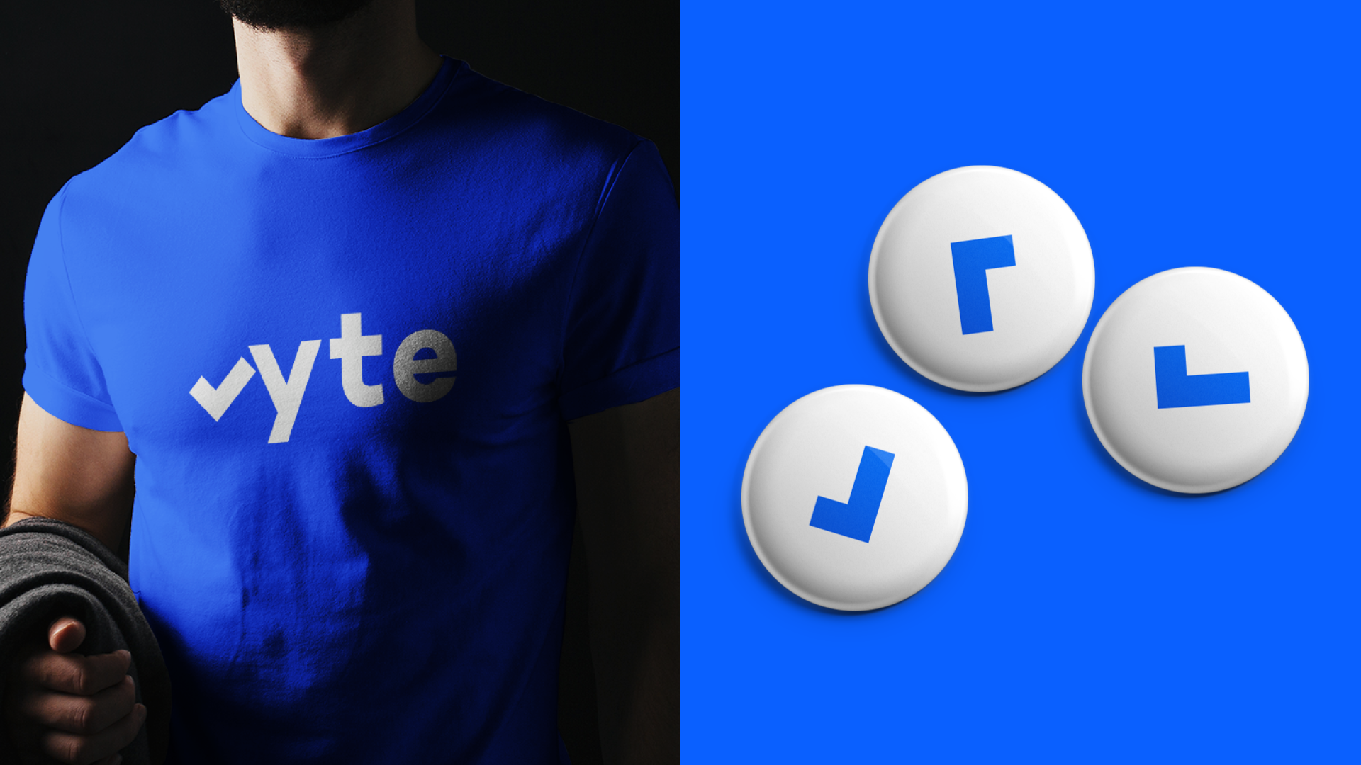
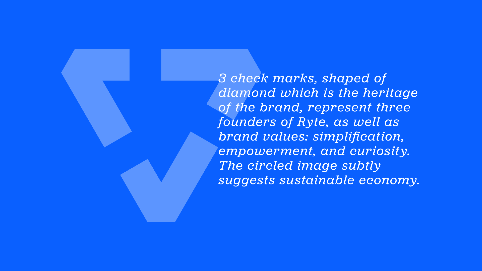
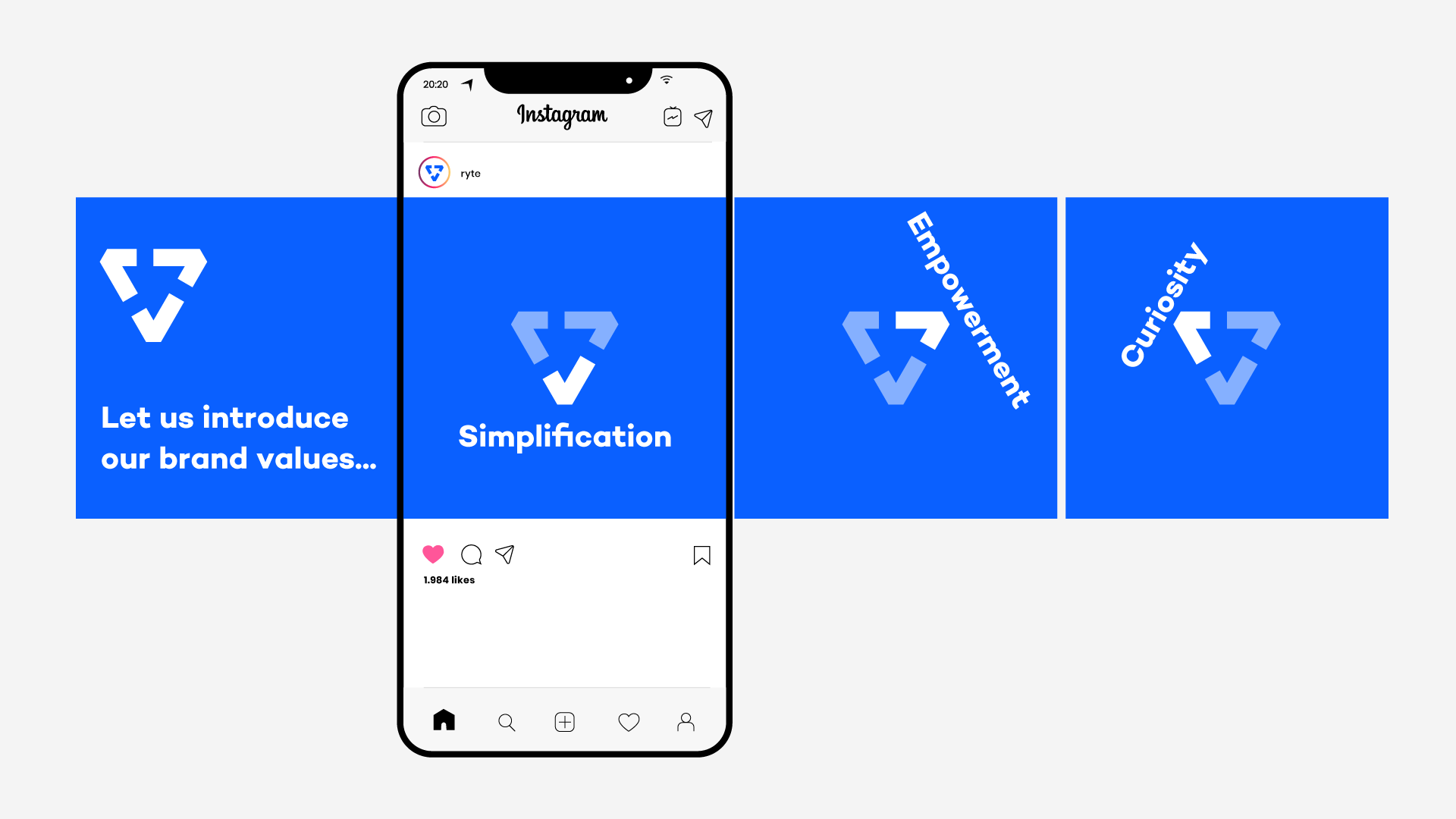
The first idea was an evolution of the old logo. While subtly keeping the shape of the diamond, I added two more check marks. Ryte has three founders and three values.The three circled check marks represent them.
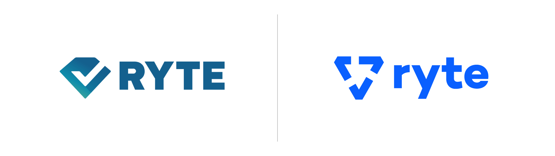
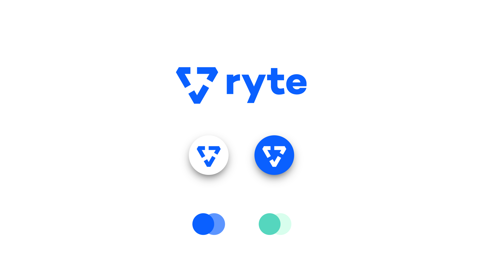
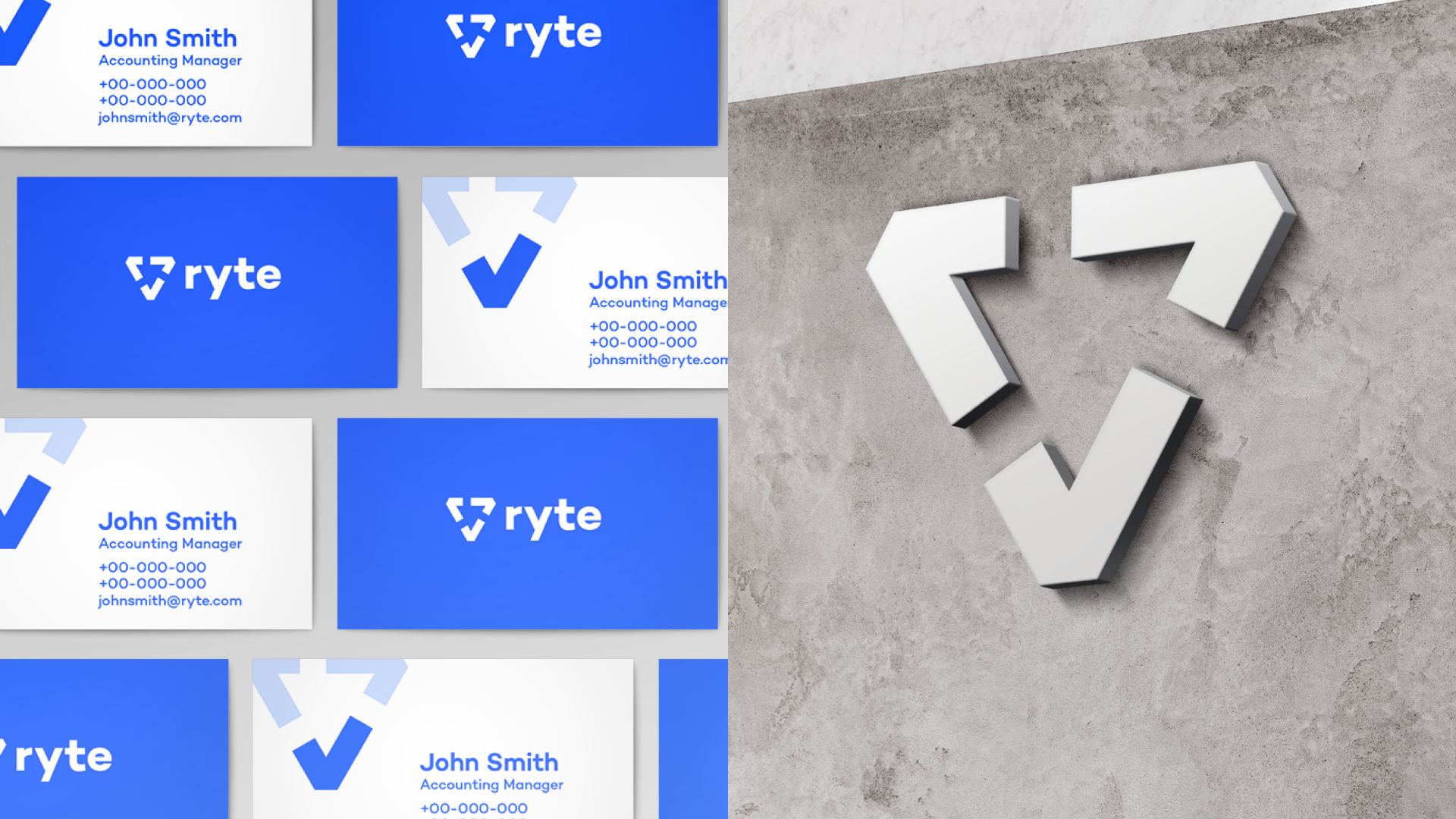

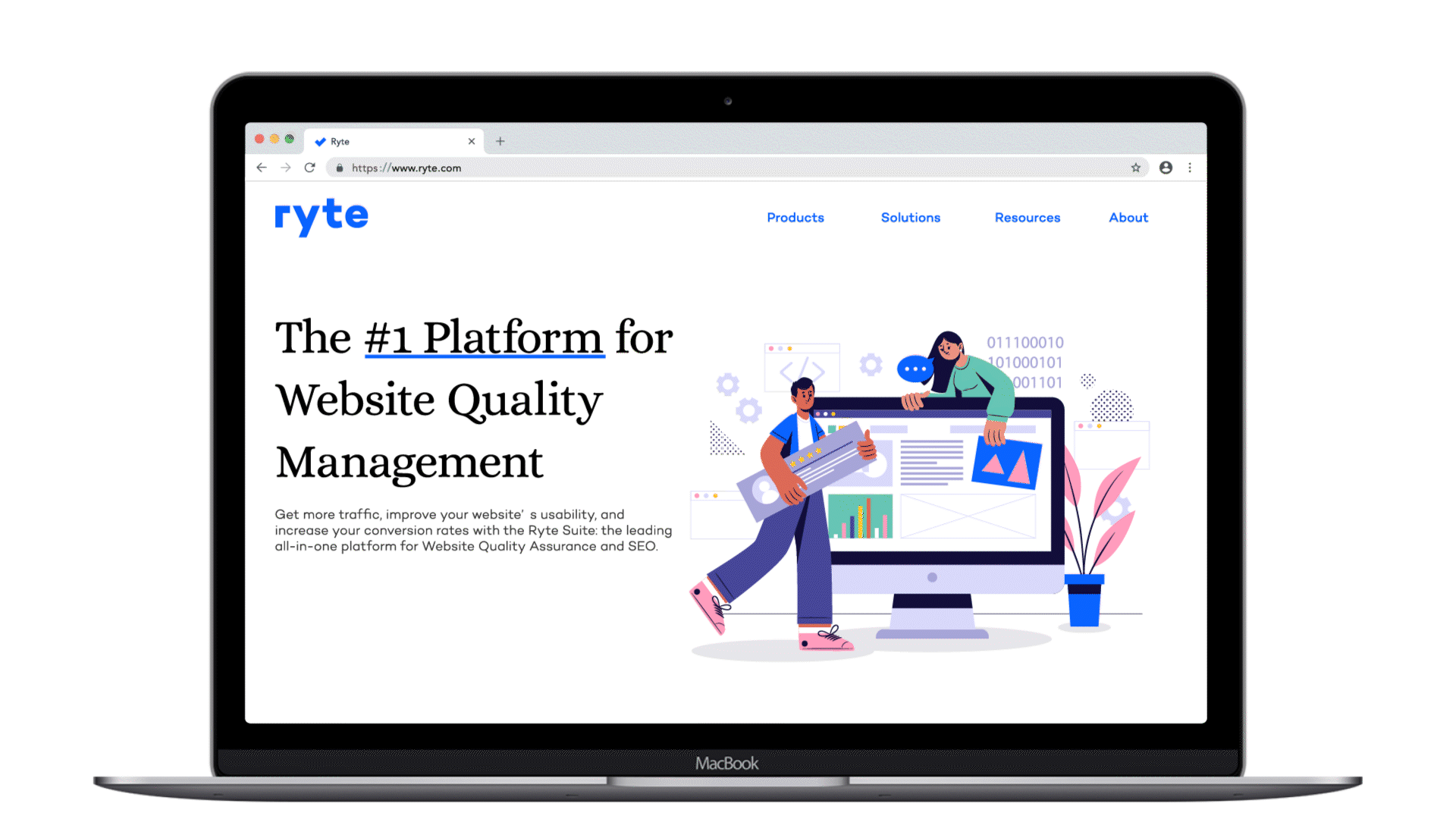
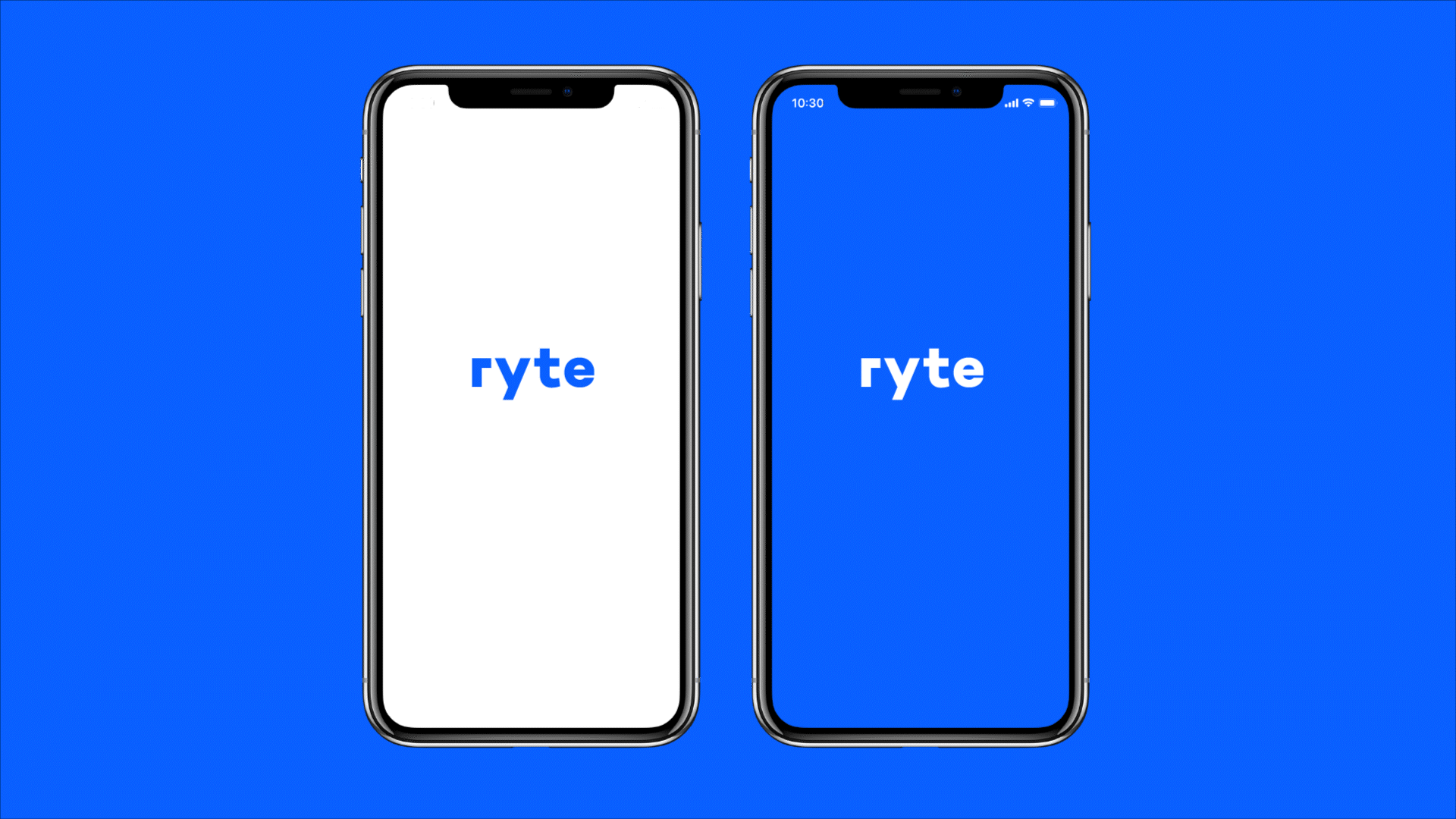
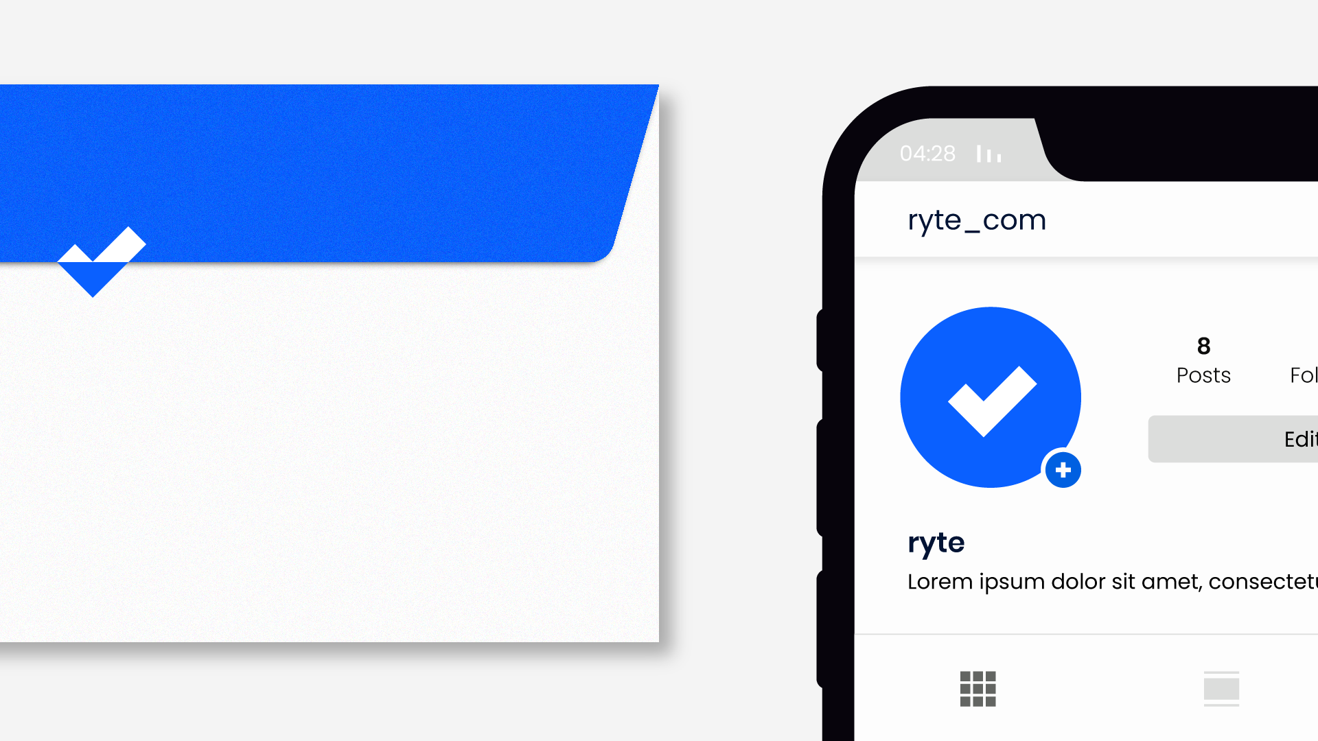
The 2nd idea is simple yet distinctive and bold. No need to explain it👇👇