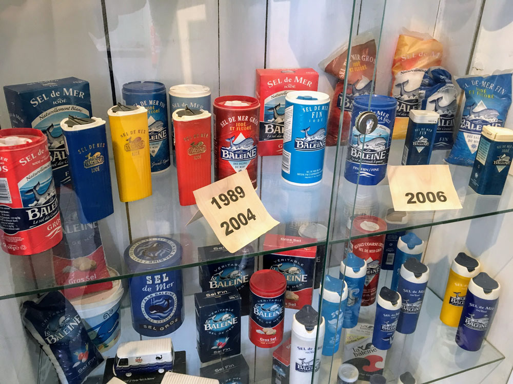
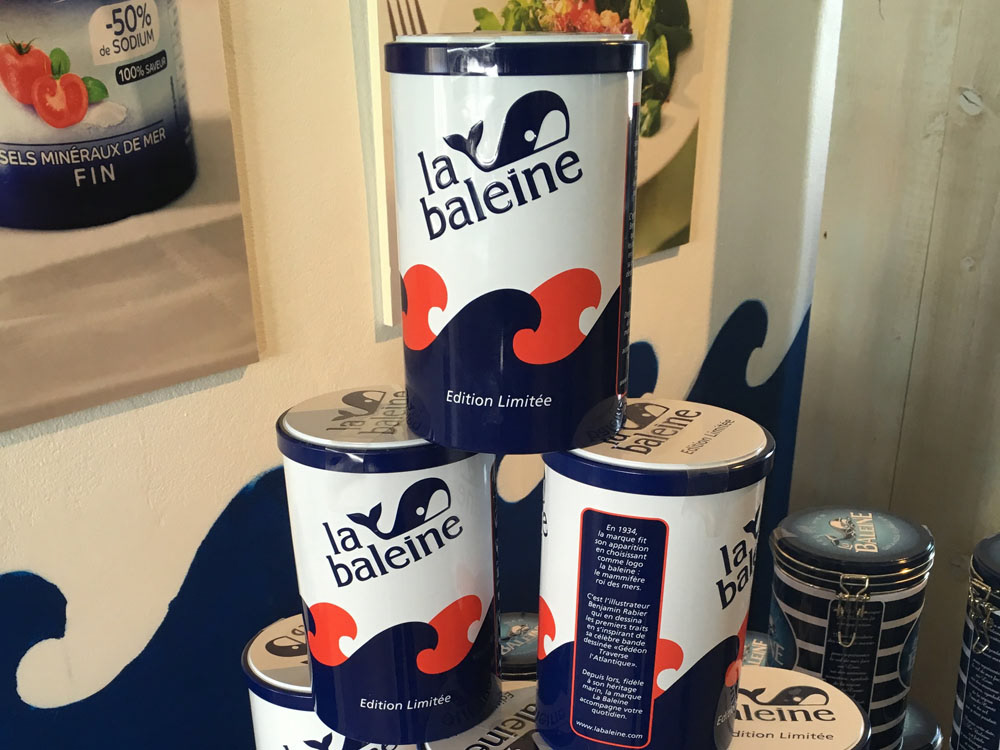
La Baleine, which means a whale in French, is a major sea salt brand by Salins, a sea salt company based in Paris. Personally, after starting living in France, the first brand I remembered at the supermarket was La baleine. One day in summer, I visited their factory at Aigues-Mortes, a commune in the Gard department in the Occitanie region of southern France, just for sightseeing. When I entered the museum besides the salt pans, I was pulled in the display of their brand history. Then, I started to explore this rebranding concept.
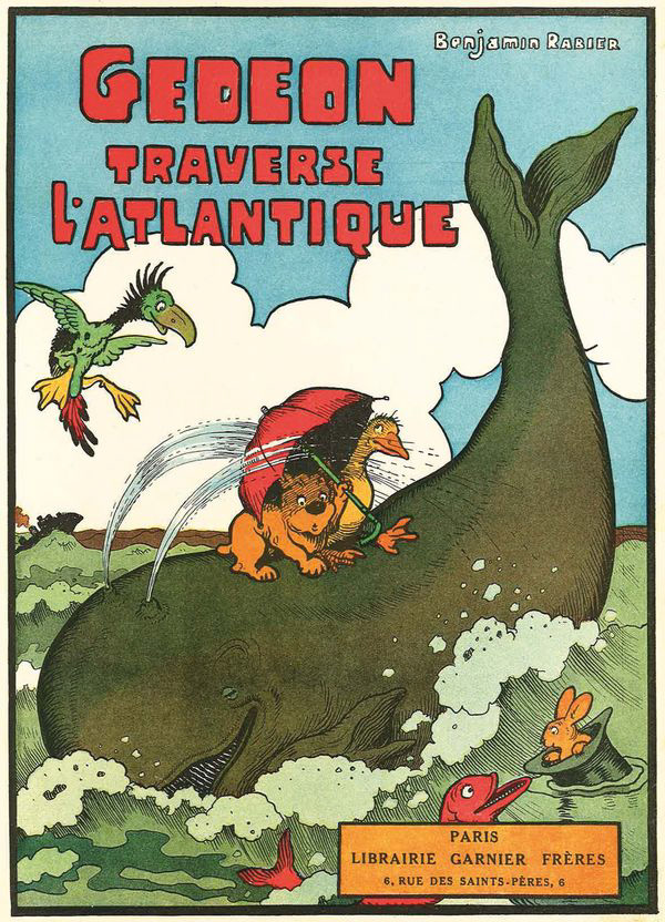
Top left: "La Vache qui rit" (The Laughing Cow) by Benjamin Rabier
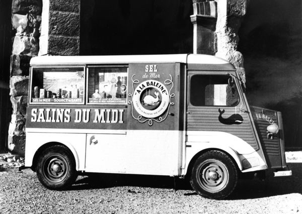
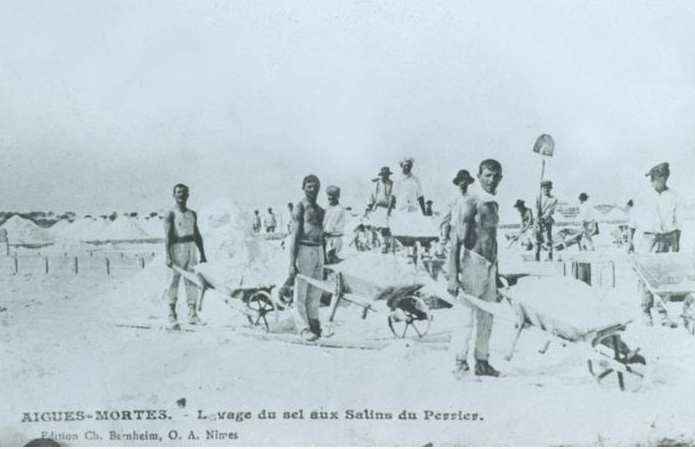
Top right: At Aigues-Mortes, the salt pan at south of France
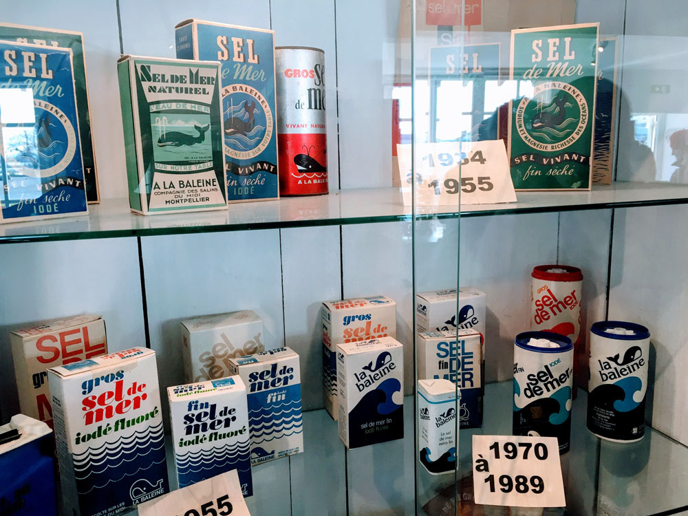
Bottom: At the museum besides the salt pan at Aigues-Mortes
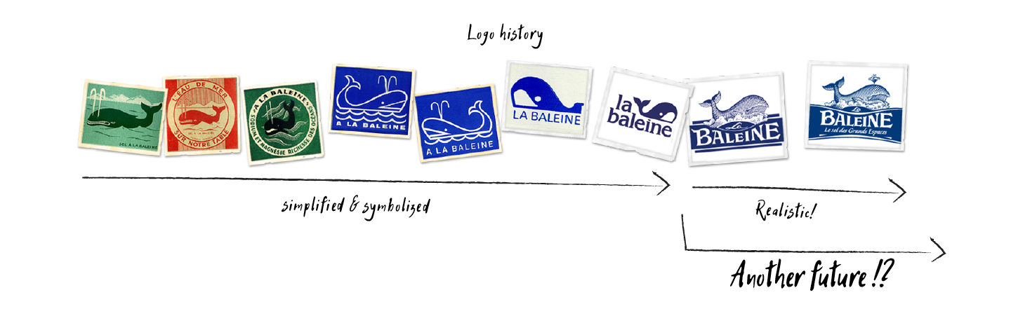
The logo history
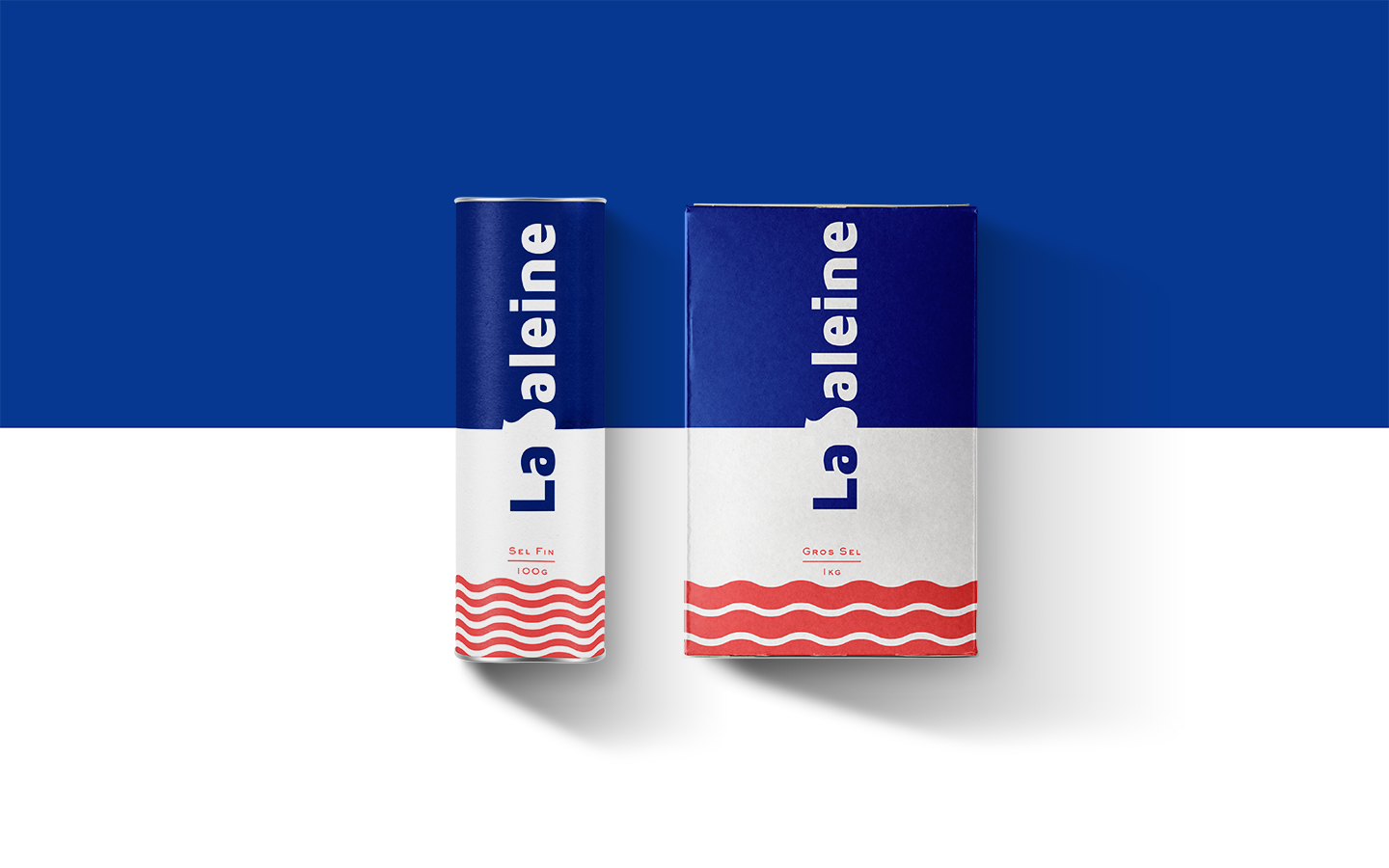
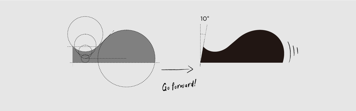
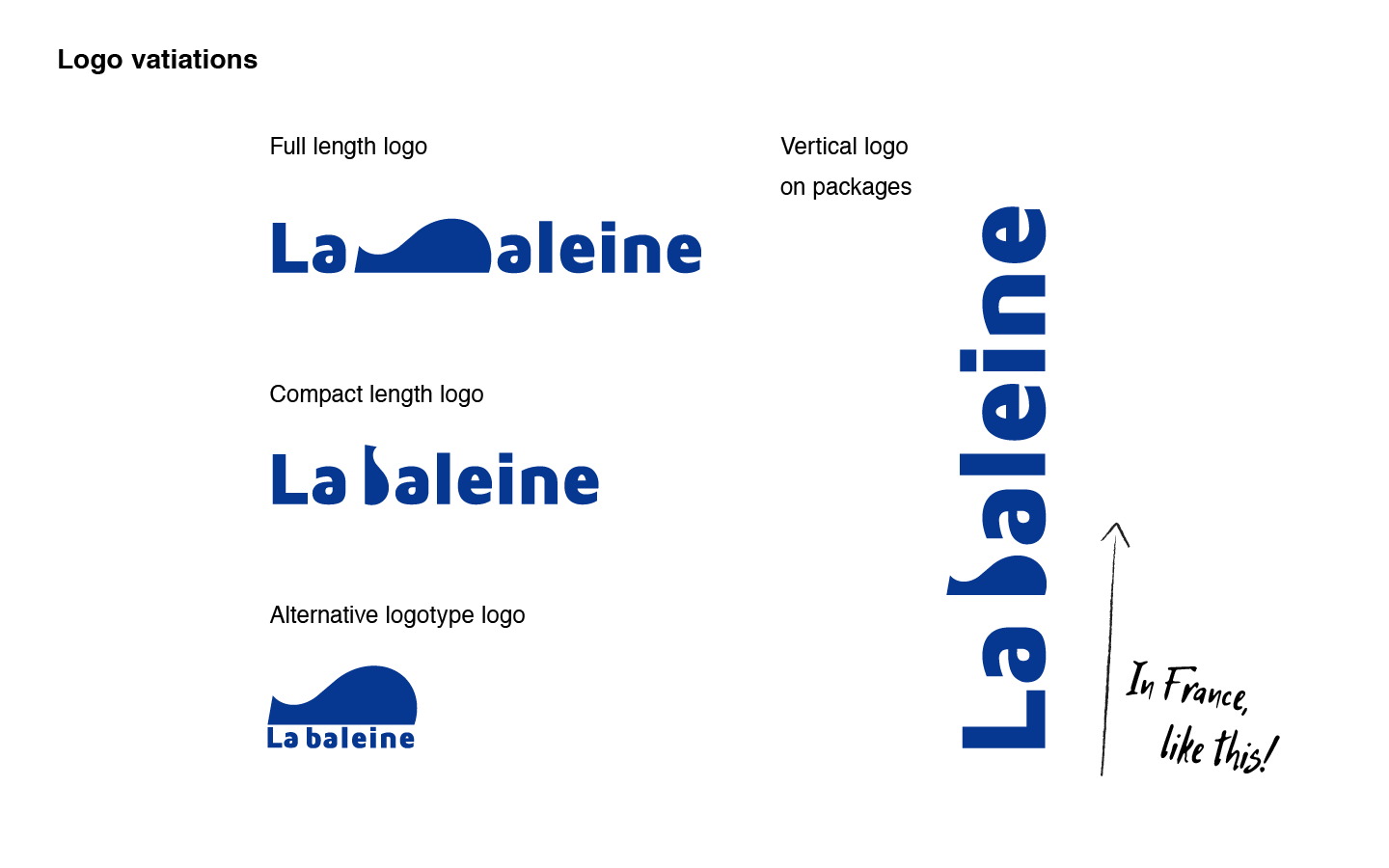
The concept of the logo
I simplified the silhouette of the whale in 70's and 80's logos, because they were cute! And I found that the silhouette of the whale closes to the shape of rotated "b" , so I put the whale in the words. Perhaps, the readability would be the problem, especially when it's written horizontally. However, once it was written vertically in French style ( from bottom to top ), the problem disappeared and the whale started to swim on the packages.

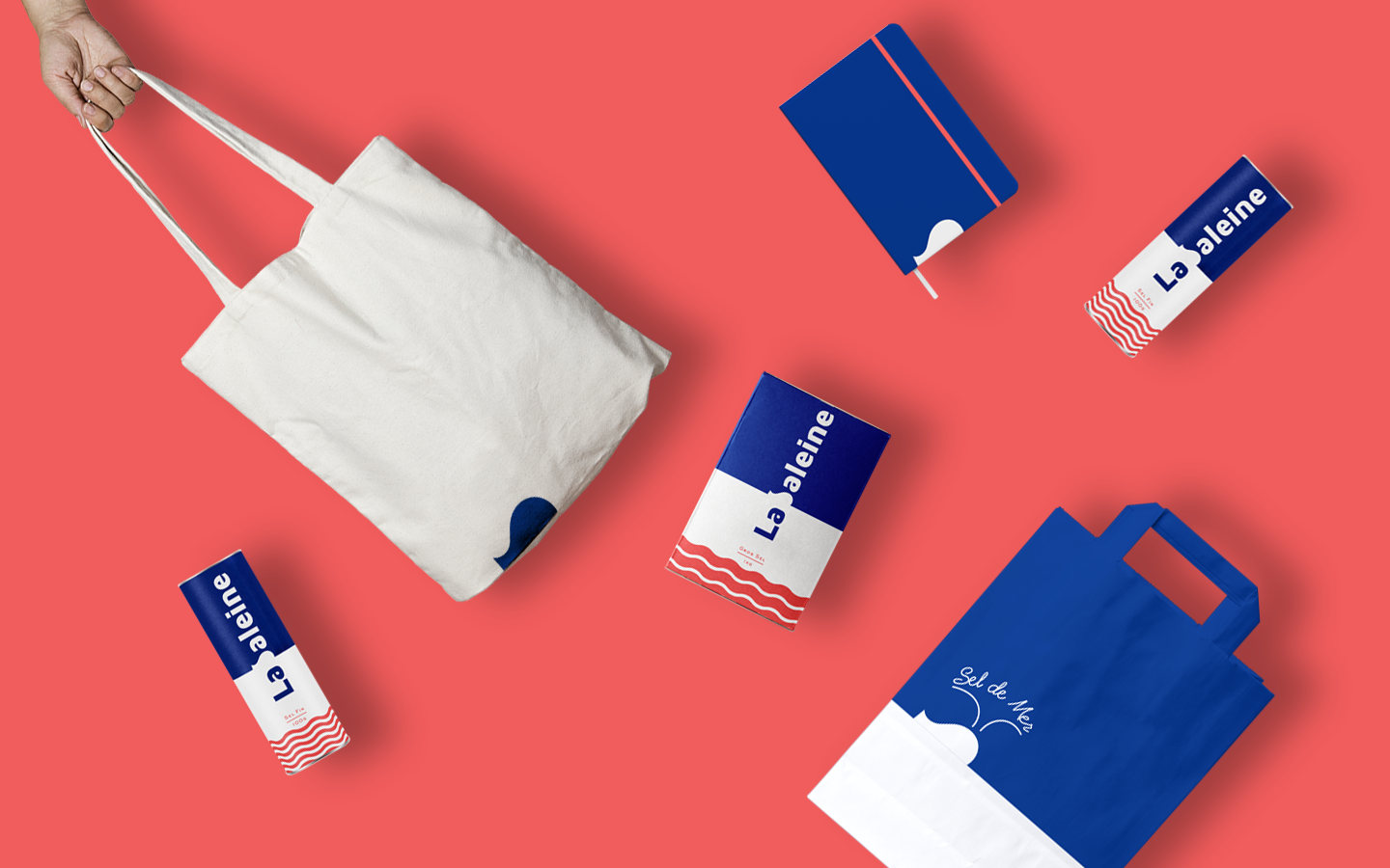
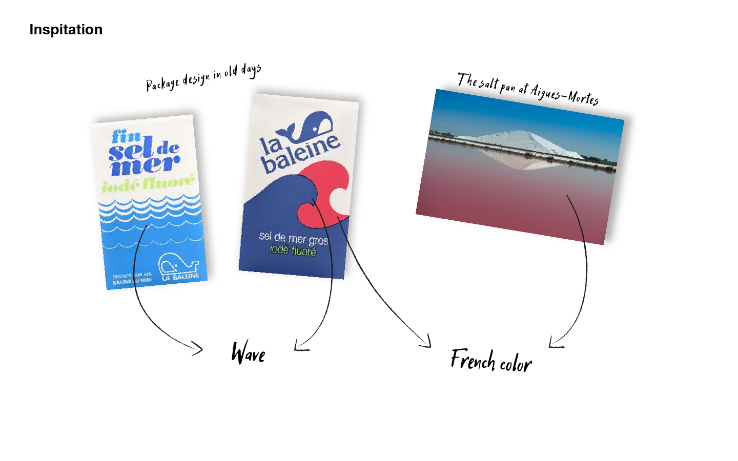
The French color and wave
From the old packages, I found the blue and red waves on white background, which might had represented "the sky, the sea, the salt pan at Aigues-Mortes, the salt", and also France. Therefore, I made the package designs like they are representative of France.
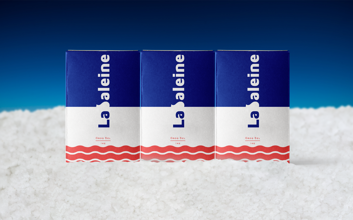
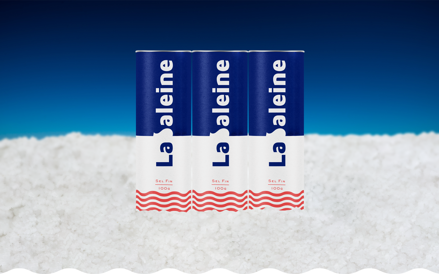
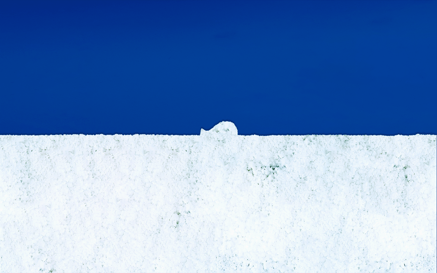
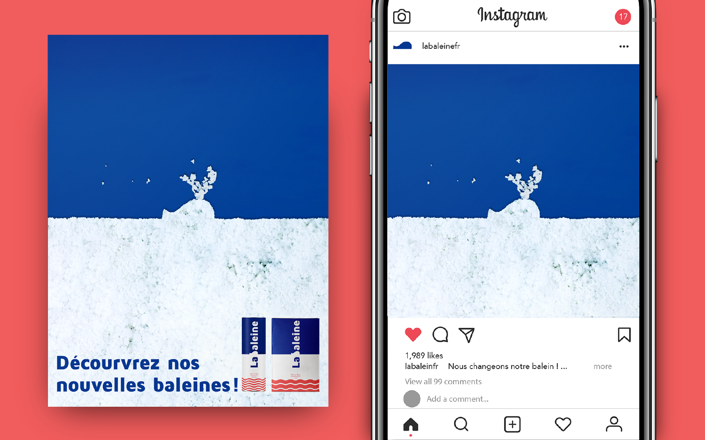
The whale swimming in the "salt sea"
Assumed to inform their changing to people, I made a simple but playful graphic. From this image, you can see why the whale and the sea part are white. Apparently it represents the salt!