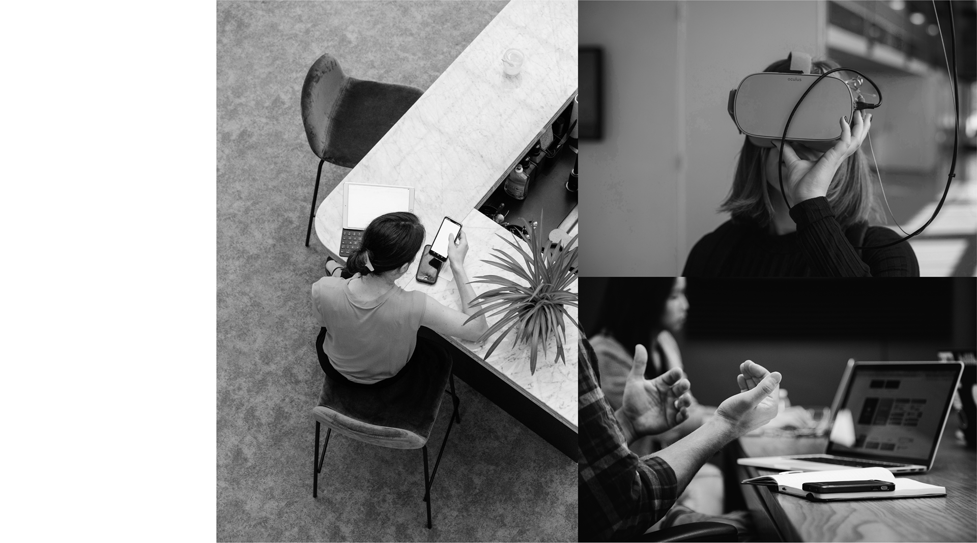
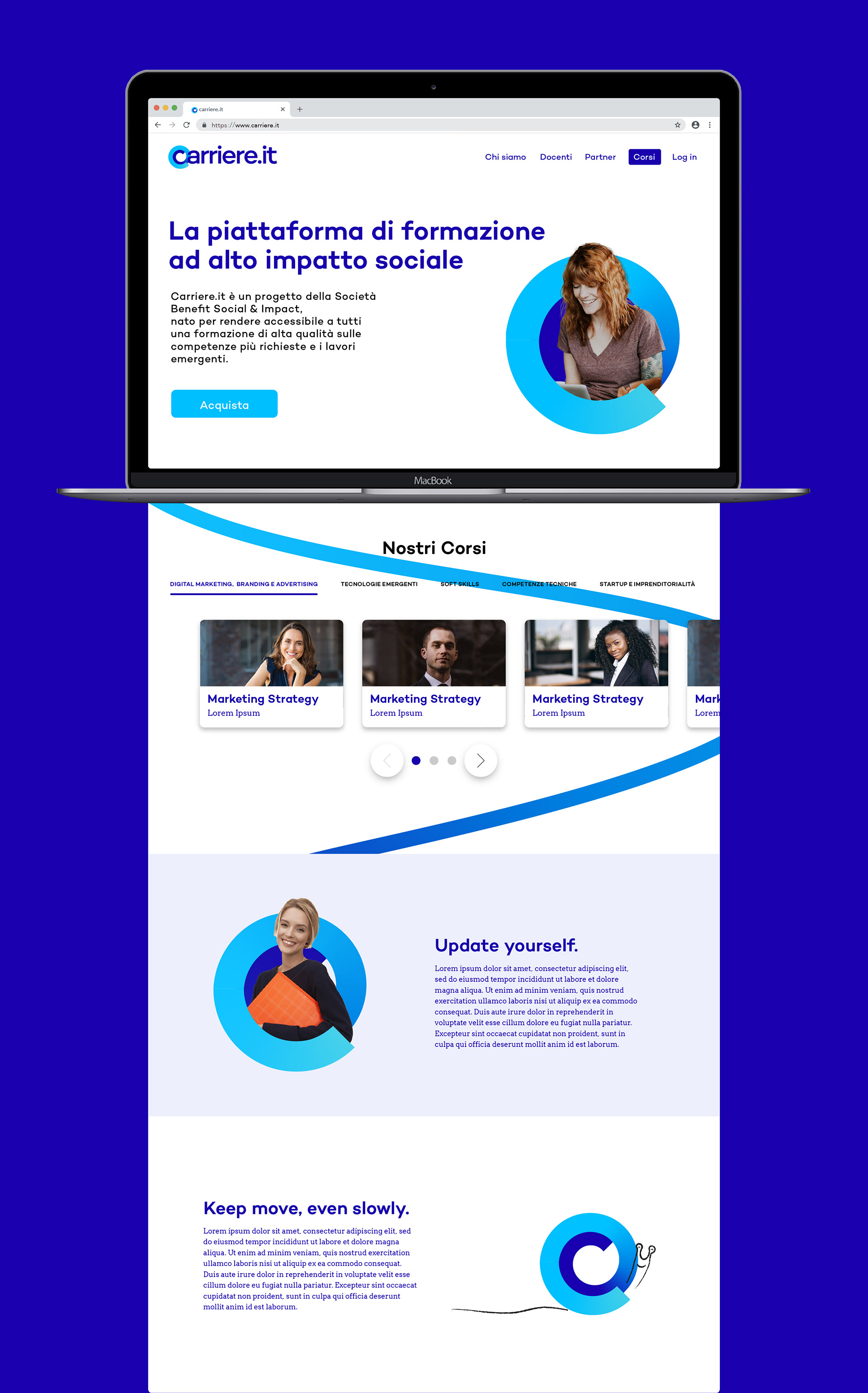
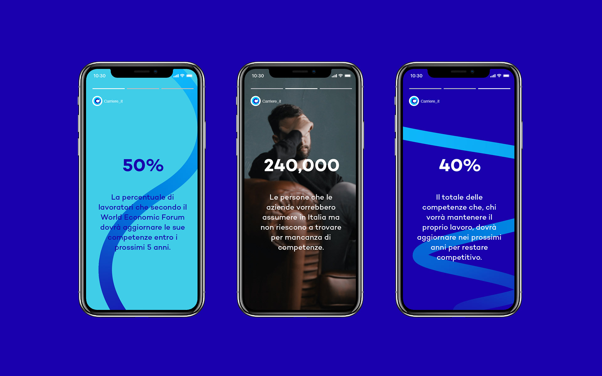
Carriere.it is an online training platform in Italy, where people can learn the most requested skills for the future —technology, digital marketing, etc. The project aimed to create a visual identity.
When you think of “career” or if you search images on google, you probably get stairs. The symbol of career. But does this “linear” symbol fit the era of “circular” sustainability?
Actually, the client wanted to indicate on the logo “improving oneself while focusing on social impact and environmental sustainability”. So I was wondering how the career of this era looks like.
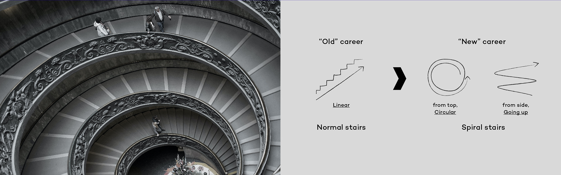
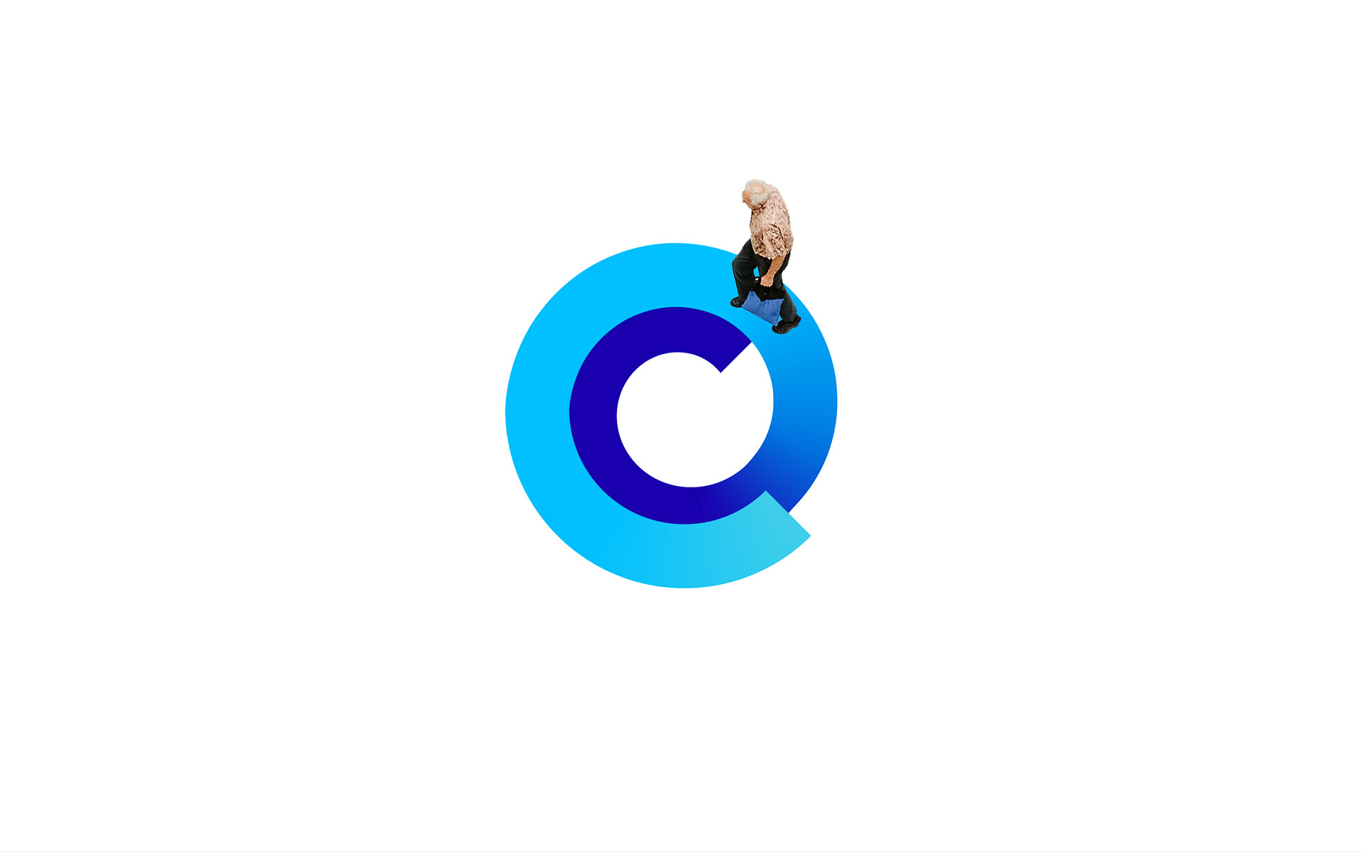
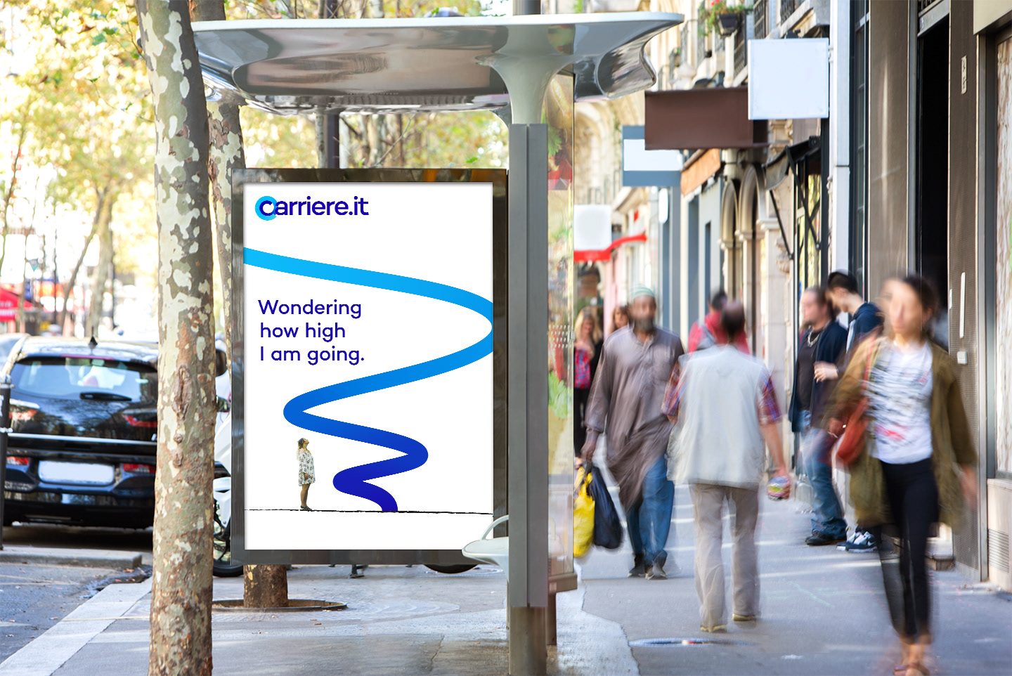
If old “linear” improvement is “normal stairs”, next new “circular” improvement would be “spiral stairs”. We will study and get new knowledges and skills many times in our lives, unlike we used to do only one job with one skill after graduating from school. It looks like we are coming back to same positions —when you study a new skill— but actually, we are going up.

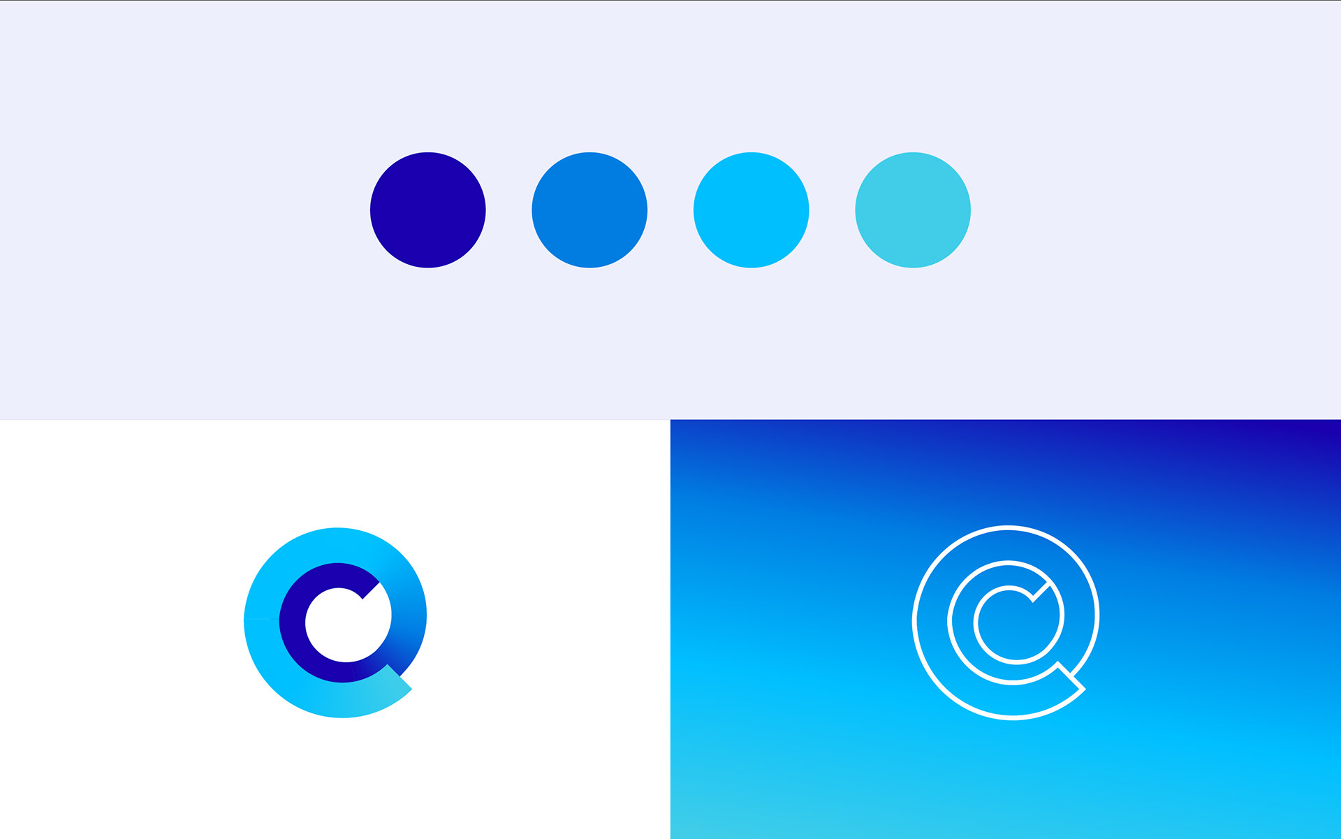
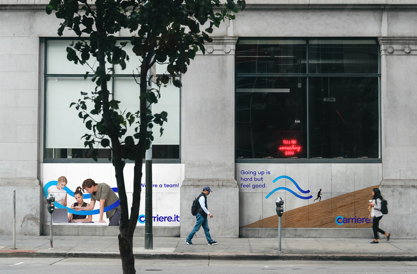
The logo is consisted of a gradient line which can be transformed to any graphic elements. The brand identity will have strong consistency, instead of sameness.
Feedback
Akihiro conveyed complex concepts with simple and immediate design.
– Giulia Lapertosa, Co-founder of Carriere.it